Develop an Awesome Glassmorhism CSS generator - #vercelHashnode project

A passionate web dev from India who loves frontend and cares to share his knowledge with other devs.
Hello Coders 👋, Today, I would like to share an awesome, useful, efficient project that I built for hackathon powered by Vercel. I was in search of a product that is less in number but has a huge impact on the community. After a search, I decided to develop an awesome Glassmorphism CSS generator.
Today, I will show you the glassmorphism CSS generator I have built as well as how you can also develop your own glassmorphism CSS generator. I will be going through the complete build process and I hope I could do it in my best way.
Glassmorphism CSS generator
Inspiration
Glassmorphism is one of the leading trend of 2021 and need keeps on rising. The absence of an efficient glassmorphism generator is a major cause for web developers not using glassmorphsim trend. (Execept the glassmorphism generator built by Hype4)
So, I decided to stop that problem as well as to educate my fellow coders how you could create a glassmorhism css generator with React.
Why Glassmorphism CSS generator
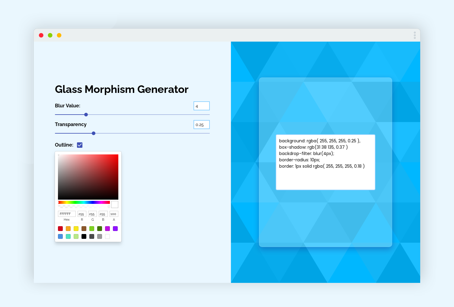 This Glassmorphism CSS generator built by me is super simple, powerful, easy to use, simple minimal UI design. It is well enough to be used on a daily basis. It auto-updates and saves a lot of time.
The awesome features of Glassmorphism CSS generator we're gonna build -
This Glassmorphism CSS generator built by me is super simple, powerful, easy to use, simple minimal UI design. It is well enough to be used on a daily basis. It auto-updates and saves a lot of time.
The awesome features of Glassmorphism CSS generator we're gonna build -
- Efficient to manage blur effect
- Mange the transparency
- Support the outline
- Choose your own color for the background
- Auto-updating the live preview
- Simple, minimal UI
Live Demo: https://glassmorphism-css-generator.vercel.app
Github Code: https://github.com/divyaxavier/glassmorphism-css-generator
Tech stack
 We're gonna build this project in React. React is an open-source, front end, JavaScript library for building user interfaces or UI components. It is maintained by Facebook and a community of individual developers and companies.
- React
- HTML
- CSS
- Javascript
How I built it
I built the project completely on React and hosted it with Vercel. I used material-ui and react-color for the UI and functionality. The useState hook plays the main role here, It does the main job. It controls the slider movements and updates and generates code.
Challenges I ran into
I spend a lot of time discussing and designing the UI and UX. I needed it to be simple, yet good. I did want my app to be of good code - that means others could also read it. It was the first time I hosted a react app on Vercel, I was using vercel for most of my code, but I haven't used it for react. Vercel is wonderful, It hosted my app so fast and it updates the app on my every commit ASAP. I did got errors but somehow I managed to overcome them. Another thing that stricked me is that I should convert the hex code into RGBA to make the app work along with transparency. Thanks to StackOverflow for figuring me how.
Accomplishments that I'm proud of
This project falls under the category of devtools
I'm proud enough to be part of this hackathon and was able to create a very useful devtools. I learned a lot while doing this and I have made it happen.
What's next
I'm planning for a lot of features to this project and here are some of this which I will say sure.
- Develop a chrome extension with generate glassmorphism css
- More previews for glassmorphism in the website
- Copy code button
- Color popup
- Feature of downloading the glassmorphism preview as SVG
License
The project is licensed under MIT
Contributing
Feel free to add an issue or a pull request because your words matter.
Development
So, it is time to get onto coding this project. I hope you have got a basic understanding of what we're gonna build.
Let's start Coding
As I have said earlier, we're gonna code this project in React. For creating a react app we should open the terminal and type the create-react-app command
npx create-react-app glassmorphism-css-generator
After opening the folder in your favorite code editor. And then remove unwanted files from the src folder. This is the file structure of our app.
root/
├── public/
         ├── index.html
         ├── logo.png
         ├── maifest.json
         └── robots.txt
├── src/
         ├── Box/
                ├── Box.css
                ├── Box.js
         ├── App.css
         ├── App.js
         ├── App.test.js
         ├── index.js
         ├── reportWebVitals.js
         └── setupTests.js
├── LICENSE
├── .eslintcache
├── README.md
├── package-lock.json
└── package.json
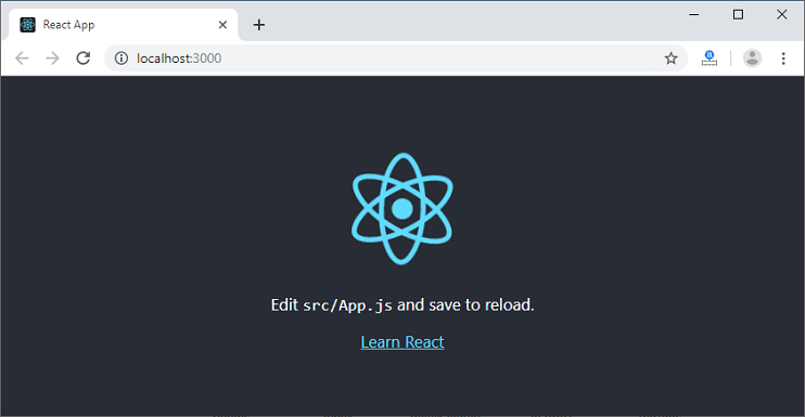
Now, lets start our project by running npm start. Then you could see this output.
For this project we're gonna use 2 npm packages
@material-ui/corereact-color
Install both of them by,
npm i @material-ui/core react-color
After installing them, lets head over to App.js. First, we should import them on our project directory.
We use material-ui for the checkbox and slider and react-color for the color box. After the import we should define our useState hooks and store the data. The handleChange function is just to change the checkbox from checked to unchecked and vice-versa. After this we should return or render our app, So here goes the complete code for App.js
import { Slider } from "@material-ui/core";
import { useState } from "react";
import "./App.css";
import Box from "./Box/Box";
import Checkbox from "@material-ui/core/Checkbox";
import { SketchPicker } from "react-color";

function App() {
  const [blur, setBlur] = useState(40);
  const [transparency, setTransparency] = useState(25);
  const [checked, setChecked] = useState(true);
  const [color, setColor] = useState("#ffffff");

  const handleChange = (event) => {
    setChecked(event.target.checked);
  };

  return (
    <div className="app">
      <div className="controls">
        <h2>Glass Morphism Generator</h2>

        <div className="control_input">
          <div className="control_top">
            <h4>Blur Value:</h4>
            <input type="text" value={blur / 10} />
          </div>
          <Slider
            min={0}
            max={200}
            value={blur}
            onChange={(e, blur) => setBlur(blur)}
          />
        </div>
        <div className="control_input">
          <div className="control_top">
            <h4>Transparency</h4>
            <input type="text" value={transparency / 100} />
          </div>
          <Slider
            min={0}
            max={100}
            value={transparency}
            onChange={(e, transparency) => setTransparency(transparency)}
          />
        </div>

        <div className="control_input checkInput">
          <div className="control_top">
            <h4>Outline:</h4>
            <Checkbox
              checked={checked}
              color="primary"
              onChange={handleChange}
              inputProps={{ "aria-label": "primary checkbox" }}
            />
          </div>
        </div>

        <div className="control_input">
          <SketchPicker
            color={color}
            onChangeComplete={(color) => setColor(color.hex)}
          />
        </div>
      </div>
      <Box
        blur={blur}
        transparency={transparency}
        checked={checked}
        color={color}
      />
    </div>
  );
}

export default App;
As you can see here at the bottom I have rendered a component called Box, box act as the preview part of our app. I have passed the attributes blur, transparency, checked and color so that it could be used at Box.js.
Now, lets jump onto App.css and write some css styles to make app look good.
@import url(https://fonts.googleapis.com/css?family=Raleway:100,200,300,regular,500,600,700,800,900,100italic,200italic,300italic,italic,500italic,600italic,700italic,800italic,900italic);
* {
  margin: 0;
  padding: 0;
  font-family: "Raleway", sans-serif;
}

.app {
  height: 100vh;
  width: 100%;
  background: #eaf7ff;
  display: flex;
  align-items: center;
  justify-content: center;
  overflow: hidden;
}
.controls {
  height: 100%;
  width: 45%;
  padding: 70px;
  display: flex;
  justify-content: center;
  flex-direction: column;
}
.control_input {
  width: 100%;
}
.control_top {
  width: 100%;
  display: flex;
  align-items: center;
  justify-content: space-between;
}
.control_top input {
  border: 2px solid #8acfff;
  font-size: 14px;
  color: #000;
  padding: 5px;
  width: 40px;
}
.checkInput {
  width: 15%;
  display: flex;
  justify-content: flex-end;
  align-items: center;
}
input:focus {
  outline: none;
}
h2 {
  font-size: 2.2em;
  margin-bottom: 20px;
}
@media (max-width: 600px) {
  .app {
    display: block;
    overflow-y: visible;
  }
  h1 {
    margin-bottom: 10px;
  }
  .controls {
    width: 100%;
    padding: 30px;
    overflow: hidden;
  }
  .control_input {
    width: 80%;
  }
}
These are just the CSS styles. It fully depends on you. You could create them in your way.
After adding CSS styles, let's start editing Box.js. First, I'm destructing the attributes passed from App.js. After that I have defined a function hexToRgb, this function changes the value we get from color attribute into RGBA. This is done to make the app work with transparency. Also I have created a if else argument to make the outline true when checkbox is checked and vice versa. After completing this, We should return our Box component.
import React from "react";
import "./Box.css";

const Box = ({ blur, transparency, checked, color }) => {
  const hexToRgb = (color) => {
    const result = /^#?([a-f\d]{2})([a-f\d]{2})([a-f\d]{2})$/i.exec(color);
    return result
      ? {
          r: parseInt(result[1], 16),
          g: parseInt(result[2], 16),
          b: parseInt(result[3], 16),
        }
      : null;
  };
  const outline = "";
  if (checked) {
    outline = "border: 1px solid rgba( 255, 255, 255, 0.18 )";
    console.log(outline);
  } else {
    outline = "";
    console.log(outline);
  }
  return (
    <div className="box">
      <div
        className="box_preview"
        style={{
          background: `rgba( ${hexToRgb(color).r}, ${hexToRgb(color).g}, ${
            hexToRgb(color).b
          }, ${transparency / 100} )`,
          boxShadow: "0 8px 32px 0 rgba( 31, 38, 135, 0.37 )",
          backdropFilter: `blur( ${blur / 10}px )`,
          borderRadius: "10px",
          border: `${outline.slice(8)}`,
        }}
      >
        <textarea
          value={`background: rgba( ${hexToRgb(color).r}, ${
            hexToRgb(color).g
          }, ${hexToRgb(color).b}, ${
            transparency / 100
          } ), \nbox-shadow: rgb(31 38 135, 0.37 ) \nbackdrop-filter: blur(${
            blur / 10
          }px);\nborder-radius: 10px;\n${outline}`}
        ></textarea>
      </div>
    </div>
  );
};

export default Box;
Inside the Box component, I have created a div in which our glassmorphism effect occurs and updates. Inside the box div, There is a textarea, the generated glassmorphism CSS code comes as the value of the textarea.
So, to make our Box component better. Here goes the code for Box.css
.box {
  height: 100%;
  width: 55%;
  background-color: #00b7ff;
  background-image: url("data:image/svg+xml,%3Csvg xmlns='http://www.w3.org/2000/svg' width='540' height='450' viewBox='0 0 1080 900'%3E%3Cg fill-opacity='.1'%3E%3Cpolygon fill='%23444' points='90 150 0 300 180 300'/%3E%3Cpolygon points='90 150 180 0 0 0'/%3E%3Cpolygon fill='%23AAA' points='270 150 360 0 180 0'/%3E%3Cpolygon fill='%23DDD' points='450 150 360 300 540 300'/%3E%3Cpolygon fill='%23999' points='450 150 540 0 360 0'/%3E%3Cpolygon points='630 150 540 300 720 300'/%3E%3Cpolygon fill='%23DDD' points='630 150 720 0 540 0'/%3E%3Cpolygon fill='%23444' points='810 150 720 300 900 300'/%3E%3Cpolygon fill='%23FFF' points='810 150 900 0 720 0'/%3E%3Cpolygon fill='%23DDD' points='990 150 900 300 1080 300'/%3E%3Cpolygon fill='%23444' points='990 150 1080 0 900 0'/%3E%3Cpolygon fill='%23DDD' points='90 450 0 600 180 600'/%3E%3Cpolygon points='90 450 180 300 0 300'/%3E%3Cpolygon fill='%23666' points='270 450 180 600 360 600'/%3E%3Cpolygon fill='%23AAA' points='270 450 360 300 180 300'/%3E%3Cpolygon fill='%23DDD' points='450 450 360 600 540 600'/%3E%3Cpolygon fill='%23999' points='450 450 540 300 360 300'/%3E%3Cpolygon fill='%23999' points='630 450 540 600 720 600'/%3E%3Cpolygon fill='%23FFF' points='630 450 720 300 540 300'/%3E%3Cpolygon points='810 450 720 600 900 600'/%3E%3Cpolygon fill='%23DDD' points='810 450 900 300 720 300'/%3E%3Cpolygon fill='%23AAA' points='990 450 900 600 1080 600'/%3E%3Cpolygon fill='%23444' points='990 450 1080 300 900 300'/%3E%3Cpolygon fill='%23222' points='90 750 0 900 180 900'/%3E%3Cpolygon points='270 750 180 900 360 900'/%3E%3Cpolygon fill='%23DDD' points='270 750 360 600 180 600'/%3E%3Cpolygon points='450 750 540 600 360 600'/%3E%3Cpolygon points='630 750 540 900 720 900'/%3E%3Cpolygon fill='%23444' points='630 750 720 600 540 600'/%3E%3Cpolygon fill='%23AAA' points='810 750 720 900 900 900'/%3E%3Cpolygon fill='%23666' points='810 750 900 600 720 600'/%3E%3Cpolygon fill='%23999' points='990 750 900 900 1080 900'/%3E%3Cpolygon fill='%23999' points='180 0 90 150 270 150'/%3E%3Cpolygon fill='%23444' points='360 0 270 150 450 150'/%3E%3Cpolygon fill='%23FFF' points='540 0 450 150 630 150'/%3E%3Cpolygon points='900 0 810 150 990 150'/%3E%3Cpolygon fill='%23222' points='0 300 -90 450 90 450'/%3E%3Cpolygon fill='%23FFF' points='0 300 90 150 -90 150'/%3E%3Cpolygon fill='%23FFF' points='180 300 90 450 270 450'/%3E%3Cpolygon fill='%23666' points='180 300 270 150 90 150'/%3E%3Cpolygon fill='%23222' points='360 300 270 450 450 450'/%3E%3Cpolygon fill='%23FFF' points='360 300 450 150 270 150'/%3E%3Cpolygon fill='%23444' points='540 300 450 450 630 450'/%3E%3Cpolygon fill='%23222' points='540 300 630 150 450 150'/%3E%3Cpolygon fill='%23AAA' points='720 300 630 450 810 450'/%3E%3Cpolygon fill='%23666' points='720 300 810 150 630 150'/%3E%3Cpolygon fill='%23FFF' points='900 300 810 450 990 450'/%3E%3Cpolygon fill='%23999' points='900 300 990 150 810 150'/%3E%3Cpolygon points='0 600 -90 750 90 750'/%3E%3Cpolygon fill='%23666' points='0 600 90 450 -90 450'/%3E%3Cpolygon fill='%23AAA' points='180 600 90 750 270 750'/%3E%3Cpolygon fill='%23444' points='180 600 270 450 90 450'/%3E%3Cpolygon fill='%23444' points='360 600 270 750 450 750'/%3E%3Cpolygon fill='%23999' points='360 600 450 450 270 450'/%3E%3Cpolygon fill='%23666' points='540 600 630 450 450 450'/%3E%3Cpolygon fill='%23222' points='720 600 630 750 810 750'/%3E%3Cpolygon fill='%23FFF' points='900 600 810 750 990 750'/%3E%3Cpolygon fill='%23222' points='900 600 990 450 810 450'/%3E%3Cpolygon fill='%23DDD' points='0 900 90 750 -90 750'/%3E%3Cpolygon fill='%23444' points='180 900 270 750 90 750'/%3E%3Cpolygon fill='%23FFF' points='360 900 450 750 270 750'/%3E%3Cpolygon fill='%23AAA' points='540 900 630 750 450 750'/%3E%3Cpolygon fill='%23FFF' points='720 900 810 750 630 750'/%3E%3Cpolygon fill='%23222' points='900 900 990 750 810 750'/%3E%3Cpolygon fill='%23222' points='1080 300 990 450 1170 450'/%3E%3Cpolygon fill='%23FFF' points='1080 300 1170 150 990 150'/%3E%3Cpolygon points='1080 600 990 750 1170 750'/%3E%3Cpolygon fill='%23666' points='1080 600 1170 450 990 450'/%3E%3Cpolygon fill='%23DDD' points='1080 900 1170 750 990 750'/%3E%3C/g%3E%3C/svg%3E");
  background-size: cover;
  display: flex;
  align-items: center;
  justify-content: center;
}
.box_preview {
  height: 70%;
  width: 70%;
  border-radius: 20px;
  display: flex;
  align-items: center;
  justify-content: center;
}
.box textarea {
  resize: none;
  width: 70%;
  height: 29%;
  background: #fff;
  border-radius: 5px;
  border: 1.5px solid #8acfff;
  font-size: 14px;
  color: #000;
  padding: 10px;
  overflow: hidden;
  font-family: "Poppins", sans-serif;
}
.box textarea:focus {
  outline: none;
}
@media (max-width: 600px) {
  .box {
    width: 100%;
    height: 80%;
  }
  .box_preview {
    height: 70%;
    width: 80%;
  }
  .box textarea {
    width: 85%;
    height: 40%;
  }
}
I have also tried to make the app fully responsive, So you could see the code for that in the styles.
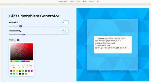
Yeah, that's it. It is working nicely and is fully responsive.
Now lit is time to check our app whether it is working perfectly. To check, just go to http://localhost:3000/.
Take help from the Github repo if you get stuck.
Wrapping up
Yeah, thanks for being with me till the end. Thanks for reading. Give your feedback and comments. I'd love to read them. Don't forget to add your reactions. I hope you loved reading this post and were able to create your own glassmorphism CSS generator. I hope you enjoyed it and looking forward to your words.

